Fidelity Investments: New Portfolio Platform
Problem: To design one centralized hub, for portfolio analysts. Coordinated with many different groups to bring this project to reality.
Audience: Internal tool for portfolio analysts
My Role/Contributions: Visual Design, Prototyping, redlining, interviewing and Research Analysis.
Tools & Technology: Figma, Sketch, InVision App, digital whiteboard, sketching.
Outcome: Successful launch of first phase of the platform, 6 months early.
Duration: 18 months
Project Overview
I had a unique, and challenging, contract opportunity with Fidelity Investments, within the Global Asset Allocation team. Our small design team worked closely with the Portfolio Analysts (PA), to create a centralized investment hub. Previous to this endeavor, the PA team would use 3 monitors, 10 programs, very heavy email communication, and the faced the decommissioning of 3 legacy programs.
My teammate was a Principal Designer who was very knowledgeable and was new to Figma. At the beginning of the project, my role was to attack the large amount backlog design. Once completed, I concentrated on learning more about a portfolio analysis’s world, and discovered what they needed from a digital product.
I learned a very simple but important rule, when working with these skilled investors; I am not designing this for myself. I bring a lot of experience and knowledge into each project, but it became very clear that this platform was for a specific group of users, with very specific needs. I’m no mathematician! Learning their world was a challenge, but I’m actually proud of myself for being a good listener, and delivering successful designs.
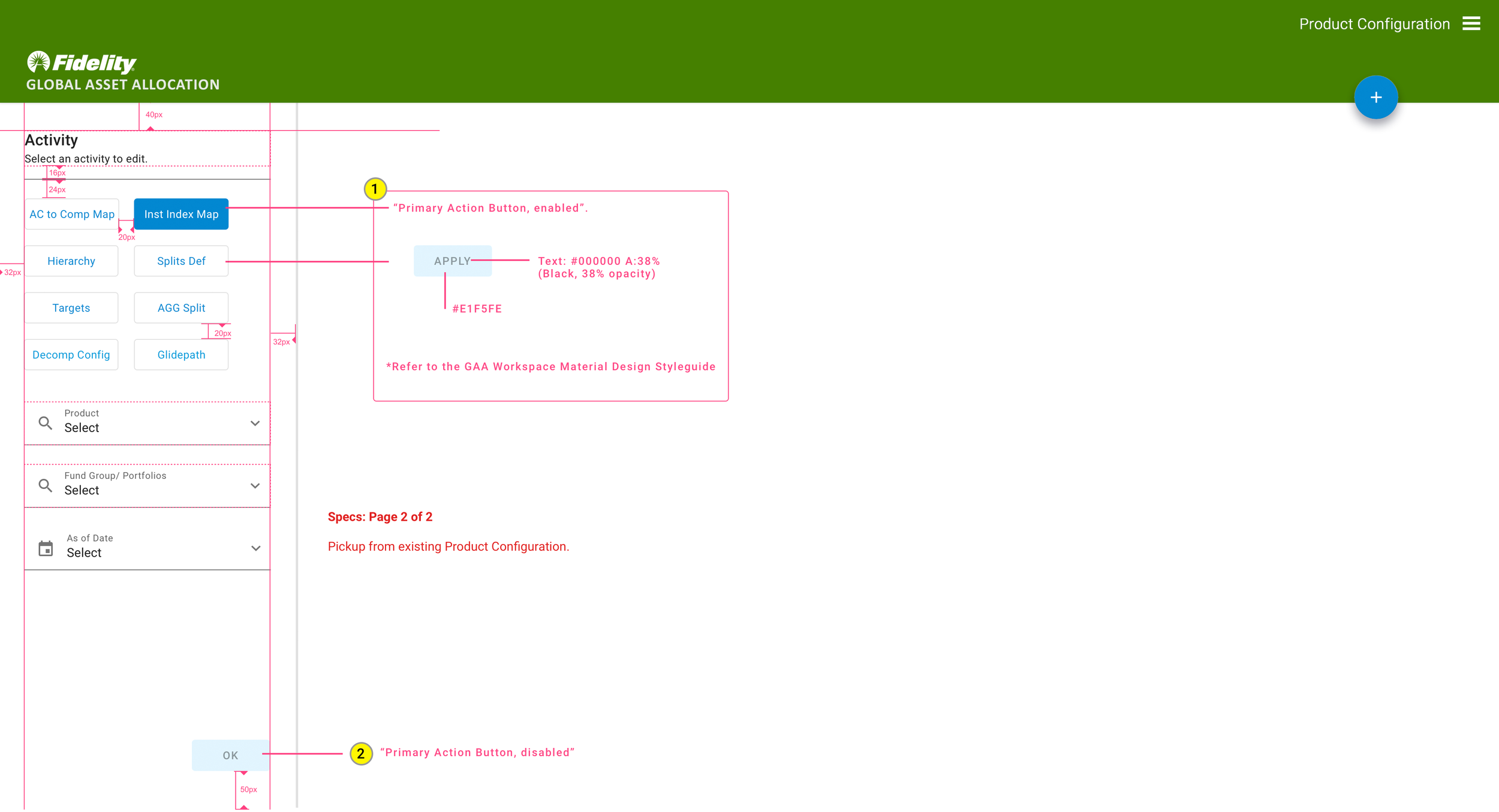
Below is the process of setting up a new fund, and customizing its measurable preferences. This consisted of daily meetings with the P.A. representative liaison, and close collaboration with the development team. We worked in a two-week sprint, and I enjoyed seeing an idea go from concept-to-reality, within that timeframe.
Once a few of these small sprints of work would be developed, we began to concentrate on the platform’s architecture. The processing of a fund, and its path, had to be determined first before creating any type of user interface. This resulted in miles of small sketches, notations and user interviews. During prototype demos, new scenarios could come into play, so the designs had to remain fluid, as adjustments were naturally part of the process. I found myself drawing my notes, rather than trying to jot every word that was said during a meeting. This new process proved to be quite efficient, and allowed for clearer and quicker execution.
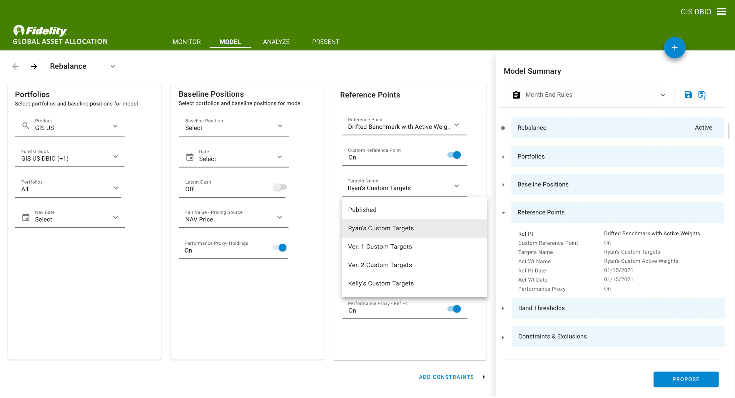
Below is an example of a short use case, designed and mocked up within one sprint, working very closely with the Development team. Depending on the complexity, often we would fully design and deliver 6-10 use cases, within a 2-week sprint.
Often, there would be opportunities for further creativity within the GAA platform. After taking a step back, I did a visual inventory of customized components, and noticed a pattern that could possibly be improved upon. Certain functions shared the same “tools”, but each trading space displayed these tools differently, in both arrangement and sequence. I shared my observations with the P.A.’s, and they agreed that the visual shift, from page to page, was awkward.
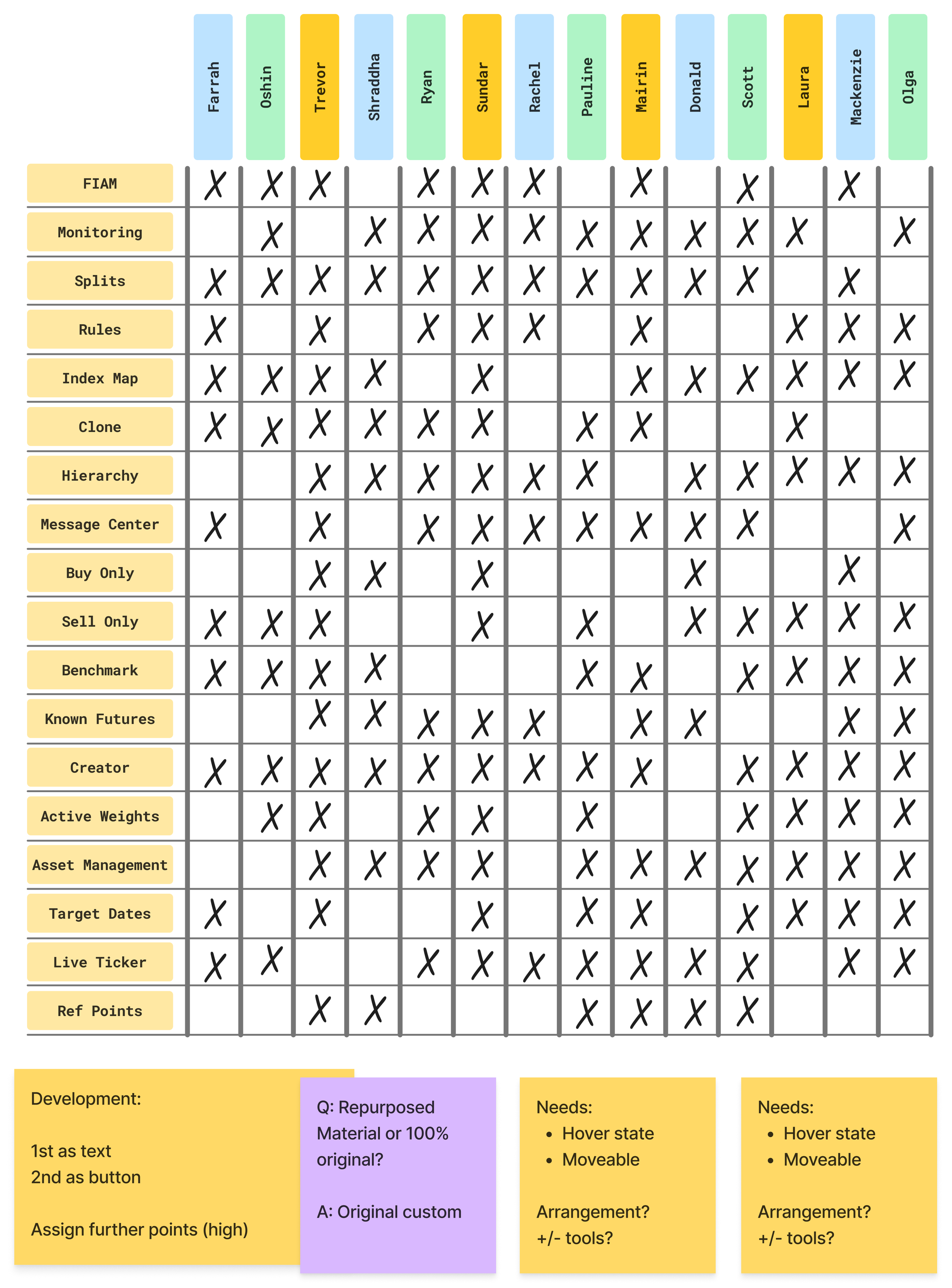
I proposed that it may be helpful that the platform have a toolbar, modeled after Adobe products, featuring the most common functions. I reached out to the Development team, and to my surprise, they were rather excited about building such a feature. My next step was to gather info from the P.A.’s, and take a vote on what features and functions were most important to them.
Assigning a visual to an investment function was a challenge, and I did numerous revisions. It was interesting to find out what type of visual would make the most sense exclusively to the P.A.’s, and to the work that they were executing.
Conclusion
I enjoyed the variety of projects that I worked on at Fidelity. As a contractor, sometimes you don’t get to view the final product, but it was great to hear that after 1.5 years, the project was 6 months ahead of schedule. My wireframe production helped to clarify needs or gaps, my interviewing skills became much better, and my toolbar concept was moving forward, into reality.


