LinkSquares:
AI-Powered Contract Management & Analysis
Problem: Customer feedback indicated several problems with the program’s workflow, often leading to a feeling of confusion or being lost.
Audience: LinkSquares customers.
My Role/Contributions: UX Designer, UI Design, customer interviews, ideation, closely working with Developers.
Tools & Technology: Figma, FigJam.
Outcome: Successfully designed a new way of viewing a document’s “state” and workflow, enhancing the customer experience through feedback.
Duration: 5-month project
Project Overview
LinkSquares is a fast-paced SaaS startup, driven by machine learning and AI tokens. The LinkSquares product is quite remarkable, as it can scan legal documents and contracts, often existing on physical paper, using key phrases and customized tokens. In addition to it’s AI-powered technology, it offers the complete management of the legal documents, within an efficient and transparent platform.
Project Overview
LinkSquares had a very informed customer base, who regularly offered constructive feedback, about the product and platform. It was suggested by the business that UX should interview these customers, to find out their pains, victories, goals, etc. when using the product. These interviews were conducted by myself, another Senior Product Designer and a Senior Project Manager.
The conversations with our customers quickly revealed that our “simplified user flow”, was actually the opposite. A user was often left in a state of confusion, with little transparency of the agreements workflow. Even worse, we discovered that customers would often “trick” the system, so they could bypass certain “states”, in order to keep the agreement moving.
Empathize
We conducted interviews with 10 of LinkSquares’ customers, each session lasting an hour. The groups consisted of 2-3 users, representing a wide range of usability knowledge.
Some samples questions were:
How are you utilizing LinkSquares products within your business?
How long have you been using LinkSquares?
What features or processes are most important to you?
What features or processes do you find to be the best?
Are there any features or processes you find to be frustrating?
What would you like to communicate to our Product team? Do you have any requests?
When an interview commenced, our team would start to transfer our notes into FigJam Post-Its. Over the course of the next few weeks we would group the notes into categories, eliminate duplicates, and start to see a pattern of themes. This step in the process was invaluable, as our customer’s voice was doing the work, to mold the product.
Define
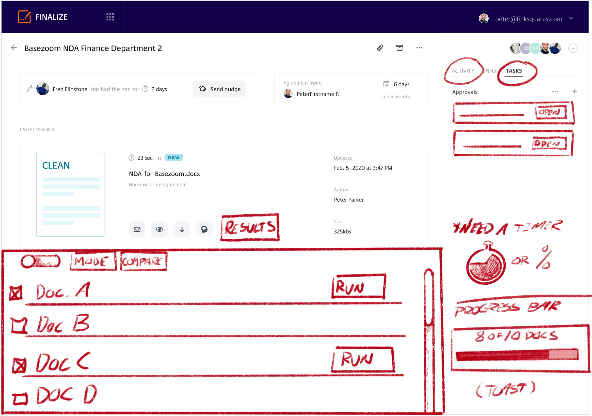
After our card sorting, there was a definite call to refine the “State” of an agreement’s path, allowing for much more transparency among the involved parties.
There was a pattern, revealing the following problems:
An actionable “State” wasn’t clearly defined, as there didn’t appear to be a single source of truth.
Additional states were needed. Could these states be customizable?
A state reflected movement, and often further details were required.
LinkSquares created this process…
…but this user feedback reflected that this was the current process.
Ideate
The good news was that this state problem was reflective of a product’s growth, and its growing pains. We did several ideation sessions, and utilized some great ideation exercises. Through our strategic groupings of reported issues, several use cases came together rather quickly. For myself, I learned a lot through this process, and found theses sessions to be the most rewarding, at this point of my career.
Prototype: Flow & Wireframes
Our wireframes appeared to be like most; grey and rough, but they played a critical role in defining a state’s path. Much less about design, they were used to define an agreement’s path. Our team could shuffle these rough wireframes and define a specific use case, which was our focus at this stage.
Solution
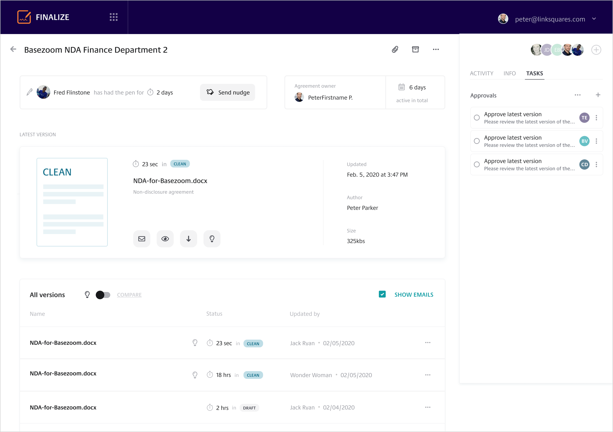
Our next step was to build a high fidelity prototype from our rough wireframes, to use for testing with a small set of customers. Since we introduced a newly revised set of states, the new terminology and design (below) were included, for customer review.
Achievements & Next Steps
Based on feedback from the prototype, customers felt that the states reflected a much more realistic workflow. In addition, the expanded categories and new terminology was positively received by the testing group.
Our final steps were to present our work to senior management, which was well-received and supported. We then scheduled time with the DevOps team, to strategically plan a phased rollout.
…but wait…there’s more!
Additional Discovery: Document Comparison
Problem: Customer feedback further indicated several problems with the program’s process and design, for Document Comparison.
Audience: LinkSquares customers.
My Role/Contributions: UX Designer, UI Design, customer interviews, ideation, closely working with Developers.
Tools & Technology: Figma, FigJam.
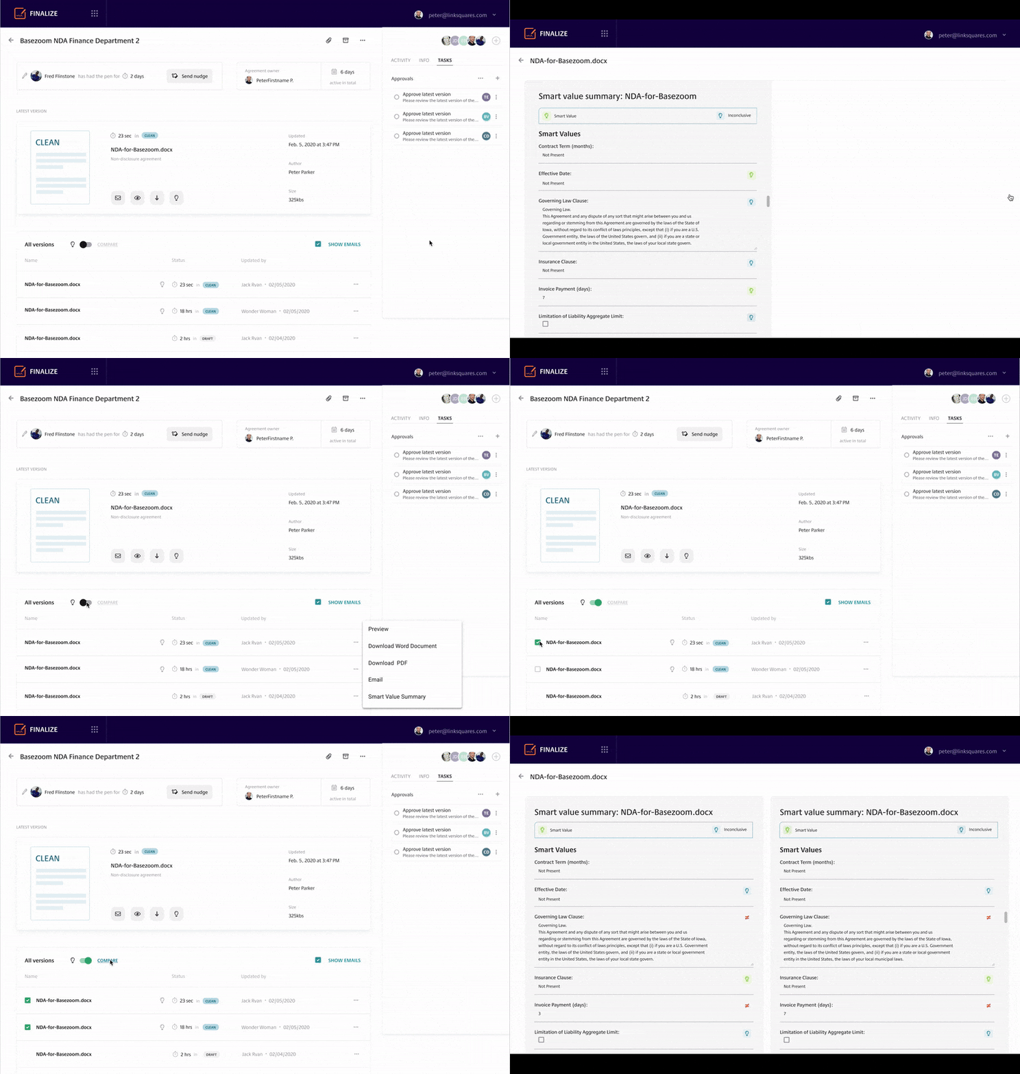
Outcome: Successfully redesigned the process, and UI, for executing a successful Document Comparison. We used a simplified approach, which resulted in a clear solution.
Duration: 2-month project
In all of our customer interviews, each group had mentioned that Document Comparison needed much more clarity. This was a fair observation, and not surprising, as the design of Document Comparison was created using a different design system, and process.
Preexisting Design
Customers have requested a side-by-side comparison, just how paper is viewed.
Desire to select documents from current history, displayed in dashboard.
Requires realtime editing, launch MS Word.
Need the ability to log in Activity.
Keep as much work as possible within the dashboard.
The goal is to display a match.
Top Customer Requests
Some wins, but the battle continues
Our team did a great job of identifying how some awkward processes required further design clarification. We used the greatest source; the customer, who used the product daily.
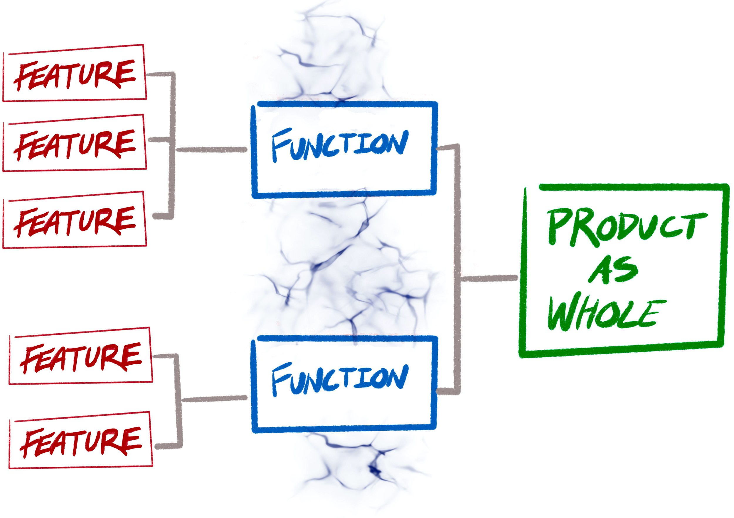
The biggest challenge was the politics of creating “features”. New features drive a startup environment, as they show growth and development, and ultimately investment opportunities. The problem was that there was a concern to “keep engineers busy”, and often products would move quickly into development without proper UX guidance. As a Product Designer, it was my job to test, evaluate and score how certain features would contribute to the product as a whole.


