XPO Direct Part 2: Product Design & Development
Problem: Continue to create a simplified user flow, for single shipping orders. Also explored warehouse logistics, and it’s challenges.
Audience: Senior Leadership, warehouse managers and transporters, XPO customers.
My Role/Contributions: Visual Design, Prototyping, interviews, Research Analysis.
Tools & Technology: Sketch, Adobe XD, Principle, traditional drawing.
Outcome: Successful launch of single-item ordering, combined with a real-world test of what would be a future warehouse management tool.
Duration: 60 days
Project Overview
The second part of XPO Direct was to concentrate more on the user experience, and warehouse logistics, rather than just UI design. Our team made the argument “Behind a small order experience, we need to take into consideration every person that is part of a package’s journey”. Each group has different needs, goals and pain points. Further discovery of these group will help to build an efficient product.
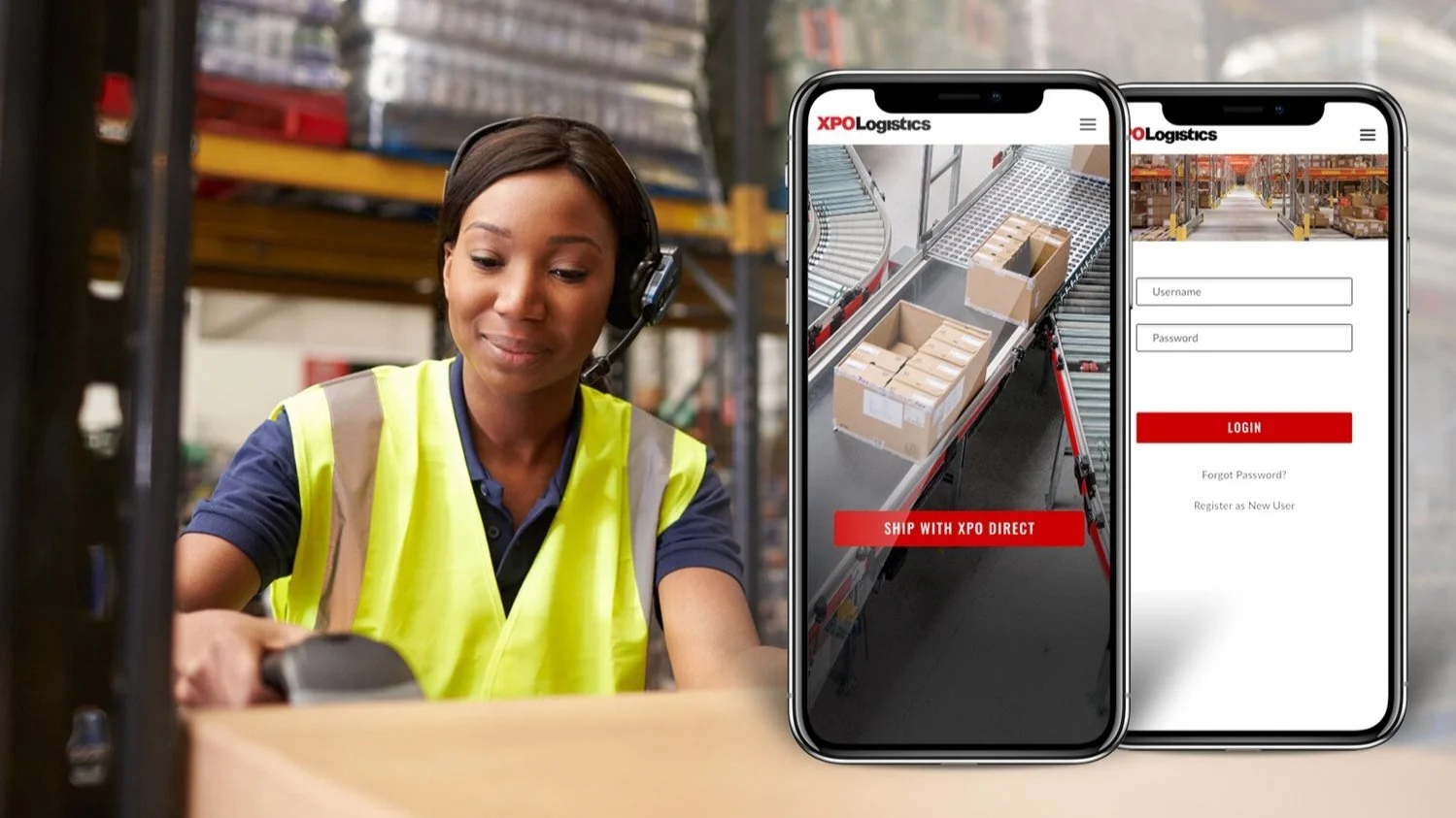
Our team met with a warehouse operations manager, distribution coordinator and data engineer. Up to this point, much of XPO’s customized shipping was done via desktop, by phone call, or a combination of both processes. Providing a new mobile experience was a great opportunity for the company!
Initial Concept
I started the process by creating a new workflow, loosely based on what existed as a hidden page on the website. Could complex shipping logistics still work in the m-Web experience? Maybe all the parts were there, and only reformatting needed to take place? Could scrolling through multi-column tables be replaced by some simplified steps?
Reverse order study: Start with “Track a Shipment”
Problem discovered: The current m-Web experience feels like a large form, crammed onto a mobile screen. Shipping data was inconsistent, as there was too much information in some areas, and not enough in others. Additionally, customers would not be familiar with terminology such as “Intermodal” or “Freight Brokerage”, etc.
Upon consulting with my teammates, I raised the question “If the user was offered an XPO app for shipping, at this stage, would they be open to using it?”. Strategically, this would occur as shipping details were displayed, in chart format. The introduction of the app would allow for a better customized building, and not feel temporary. But perhaps the m-Web experience just needed a redesign?
Research: 3 groups of interviews
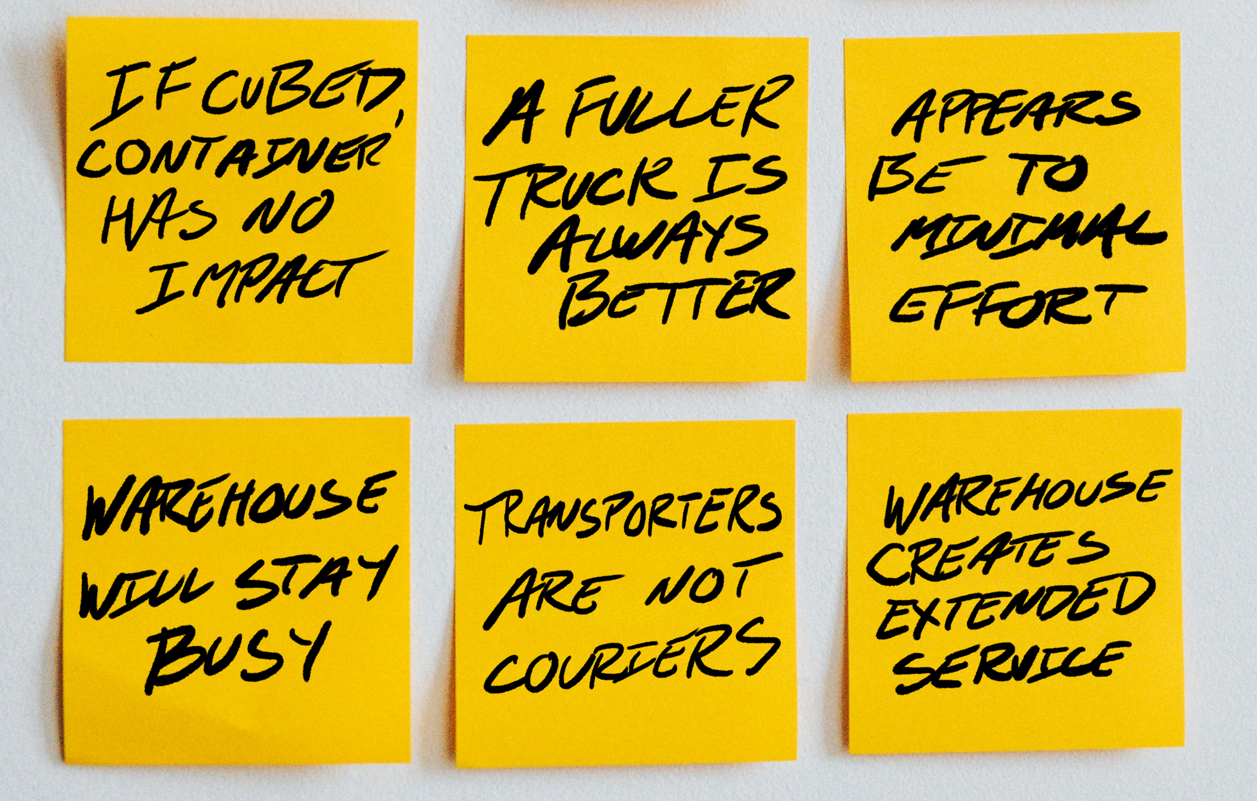
This was a quick project…almost too quick, but our team found it essential to speak with a range of users, involved in the product’s design. We gathered some great insight from the warehouse managers and drivers. The customer base was largely made from external vendors, but their input was still found to be very helpful. After the interviews, we gathered and grouped our findings into positive and negative observations.
Wireframes
Creating wireframes were always a challenge at XPO. Traditionally, stakeholders related to either low, loosely drawn whiteboard sketches, or high fidelity comps. Anything in-between, such as lo-fi grey wireframes, were often perceived as confusing, or viewed as being incomplete. Our UX team’s solution was to include more specific information, so it could move quickly to a high fidelity prototype.
Problem: Our team had to convince the business stakeholders that real-time truck logistics should not be customer-facing, but rather a backend process.
Prototypes
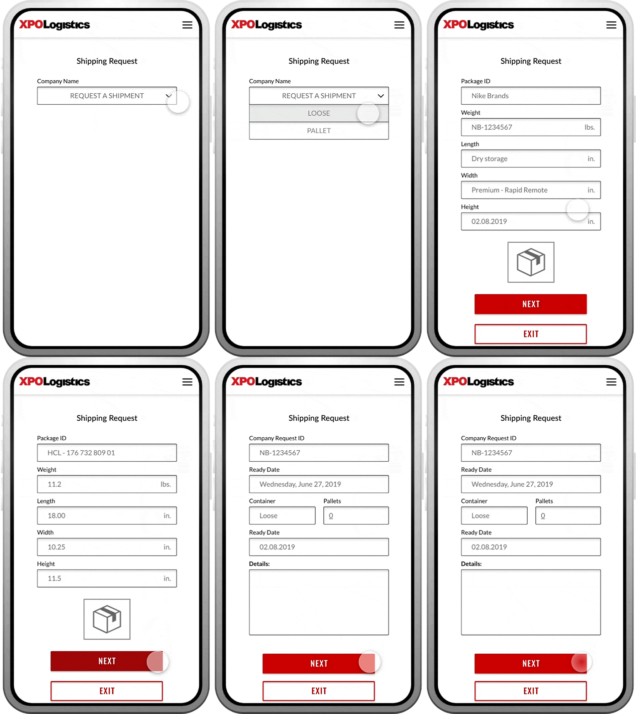
I designed a basic workflow of 20 screens, to illustrate how a package could be shipped through the mobile app. I worked closely with the Development team, to make workflow adjustments, when presented with user critique and feedback. With complex shipping, one of the goals is to reduce backend service calls.
As a side note, I wanted to try Adobe XD, specifically for the animation. The program is good for simple auto-animation, but does not have keyframes. So the first three prototypes are designed in Adobe XD, but I reverted back to Principle, for the fourth.
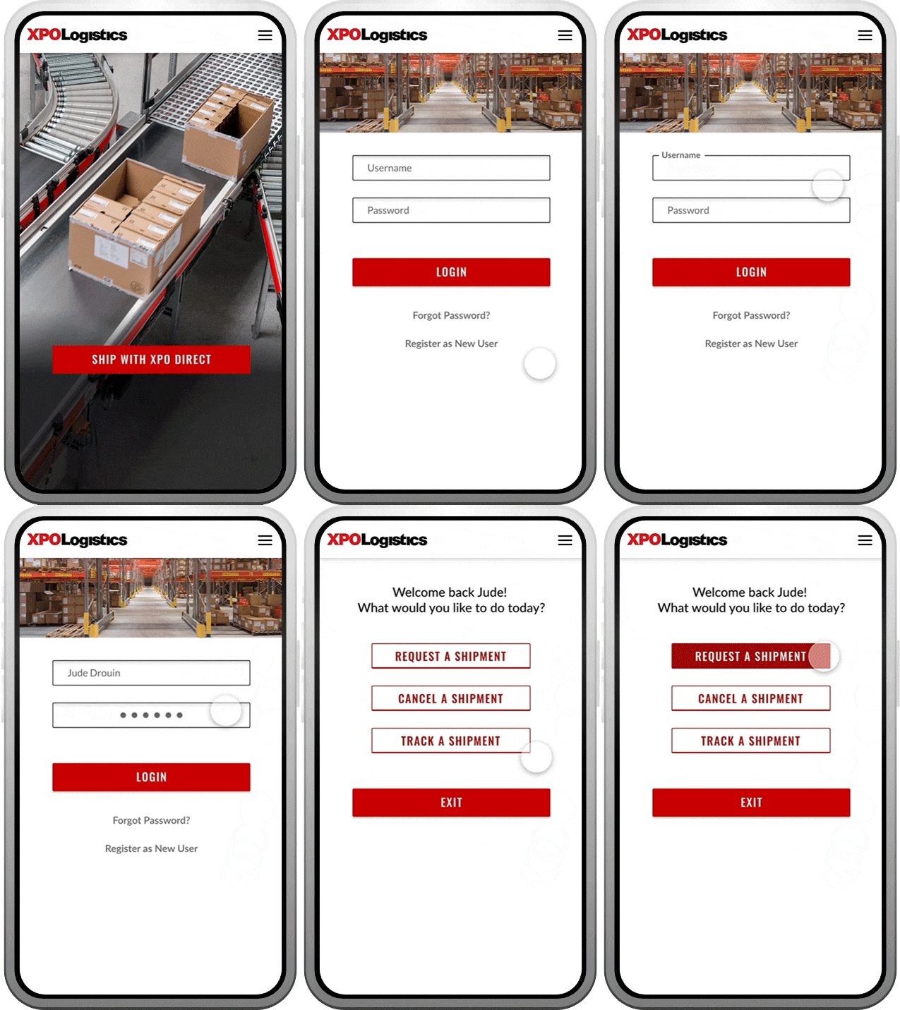
A. Login
This introduction into the shipping portal was designed to be inviting, clear and simple. The challenge with any red colored branding, is to present a path to enter, rather than be perceived as “error red”. This was achieved through an intro splash screen, and a simple two-step login process.
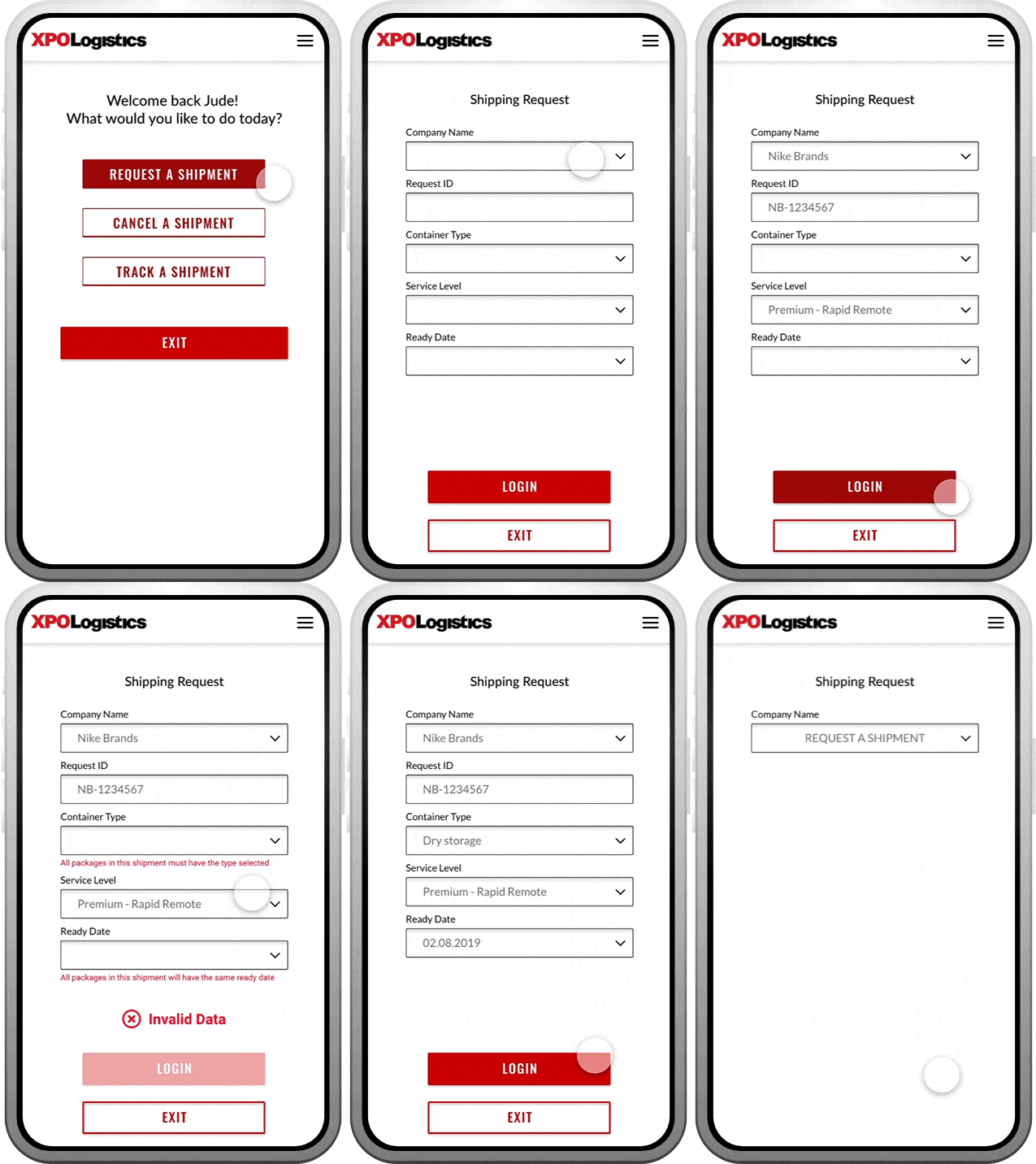
B. Shipping form
When an error does occur, it appears as subtext, and can be corrected with ease. This type of error is perceived as a minimal fix, and still creates an invitation to move forward.
C. Item details
Shipping packages with a large freight company, such as XPO Logistics, can be somewhat intimidating. By creating small consumable paths, the short screen sprints guide the user forward.
As I proposed in the original hackathon; take simple steps 1,2,3…and you’re done!
D. Confirmation
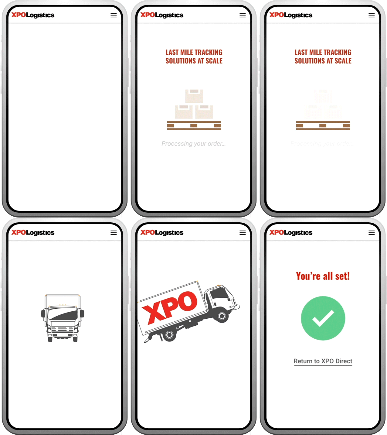
XPO Direct combines the transfer of an item from a large freight carrier, to a smaller “last-mile” courier vehicle. Processing this shipment can include complex logistics, with an average wait time of 34 seconds, or higher. Therefore I wanted to break up that processing time, with a fun loader and confirmation animation.
Result
This study and accompanying prototype, moved to Software Development for a small test run at a XPO warehouse in Connecticut.
Some observations:
This project was presented to the “LEAP: Warehouse Management” dashboard team, and careful consideration was made to the logistical service calls. Additionally, this was included in the initial pitch for a new warehouse management tool, based on live data.
Pros: There were reports of large truck capacity increasing between 4% - 10%. Small last mile trucks were still seen as the solution, as for example, a 2% increase can result in hundreds of individual packages.
Cons: Placement of single shipments were always last to be loaded (first unloaded) which caused scheduling adjustments.
You can’t change a company overnight, but this new shipment process worked (on a small scale)!

